Your crowdfunding campaign page is essentially the website of your project, it’s the sales page you use to convert visitors into backers. Whether you go with Kickstarter or Indiegogo, both platforms give you the freedom to brand your page as you like – take advantage!
As such it should be crafted with the same care you would put into a new website or project. these 3 things and you’ll succeed: You’ll be ahead of the majority of project creators if you do the following:
- Your message should be clear, concise, and motivating.
- Your images should be well-lit, crisp, and beautiful.
- Your video must be well-produced, concise, and passionate about your product.
Take a look at some of the top projects of all time, you’ll see that they all have something in common – the project pages are beautifully designed and take you on a journey.
Visitors will unconsciously equate the quality of your product with that of the quality and polish of your project page.
Here are the 3 pitfalls you want to avoid:
- Bad design
- Too much text
- Poorly described rewards
8 Key Elements you NEED for your Project Page:
- Description: Under your video, you should have a short 2–3 line description to tell visitors exactly what the project is.
- Problem Solved: This is where the problem-agitate-solve comes back into play, use this to describe the problem you faced and how your product solves this in a unique way.
- Unboxing: Unboxing videos on YouTube are extremely popular because people always want to know exactly what they’re getting. Show them this through either a GIF or an infographic.
- Testimonials: Have people tried out your product? Ensure to show reviews for social proof.
- How does it work: Dig into the nitty gritty details of how the product works, and some technical features and elements behind it. The more you can show, the more people will be confident that you have thought everything through and will be confident in your ability to deliver.
- Timeline: Let your backers know the journey behind the project and when you expect to deliver your rewards. A simple graphic shows this best.
- FAQs: This will be short before starting, the best thing to do is to consider questions your backers may have about the project and go from there. Once you go live you should be updating this as you go.
- Risks & Challenges: What are the hardest parts about bringing this project to life? Be honest and give a glimpse into the depth of the research you’ve done so people understand that you know what you’re talking about. This area is non-optional and allows for text only.
5 Helpful Visual Elements:
Not all of the above need to be text, in fact, I think it’s crucial to ensure you break up your page with visual elements. Nothing is less appealing to a potential backer than a wall of text.
I’m going to share how The Roost project used visual elements perfectly for their project page to perfectly demonstrate their product through imagery.
The project raised $785,724 (and had a funding goal of $475,000).
1. Infographics
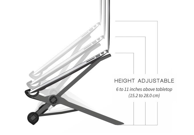
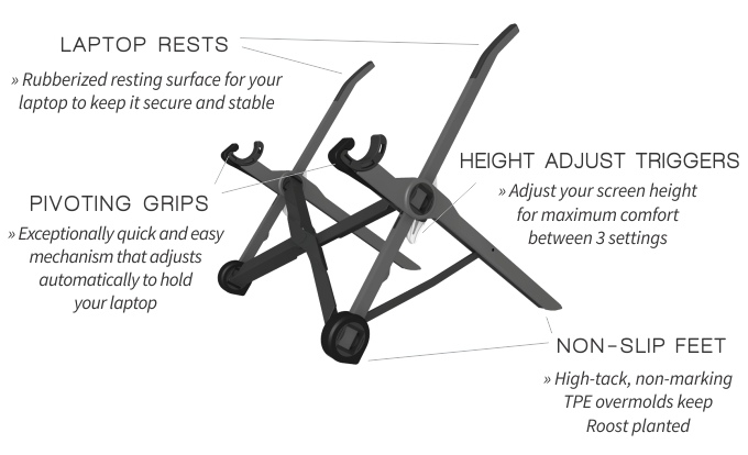
Making use of infographics is a much better way to relay information than text, people love these as they are much more likely to understand a clear graphic like these:
2. Animation GIFs:
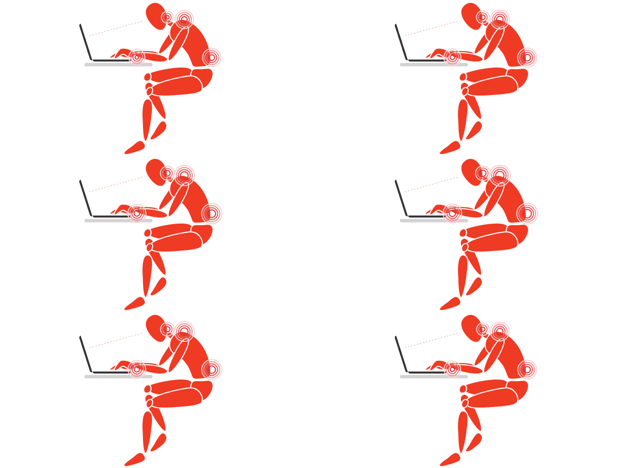
These simple animation GIFs are great for showing how a product works as short snippets. This works extremely well for complex projects that you will be able to describe much more about in a GIF.
This animation gif is simple, yet is a great visual for demonstrating the pain (literally) that his product solves:
3. Custom graphic headers
Stay on brand and with the same aesthetic for your project page, even with section headers. It’s a little more work but it’s worth it.
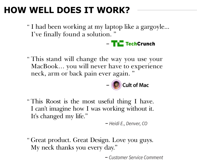
You’ll see in the Testimonial image below how The Roost Stand project used this.
4. Testimonial Graphics
Having testimonials is great, although sometimes they get lost if they’re just stuck in the middle with other text. That’s why switching it up with a custom graphic ensures it stands out and makes it less likely to be missed:
Planning your own crowdfunding launch?
Choosing the right crowdfunding platform is an early decision that holds some people up, but it doesn’t need to.
5. Rewards Image
Sometimes it’s difficult to understand the rewards structure from the standard sidebar format alone, especially if you have any complexity with what’s included.
That’s why a graphical table to visually represent the reward levels is helpful, again the goal is to make your messaging clear so any potential backers aren’t confused and end up leaving.

I have no affiliation with The Roost, only that it’s one of my favorite products. You can purchase it on his site here or on Amazon.
Examples of Great Project pages:
- The Minaal Daily and Carry-on 2.0
- The Roost Stand
- Coolest Cooler
- The World’s Best TRAVEL JACKET
- Mars Needs Mechanics
- OUYA: A New Kind of Video Game Console
- The Everyday Messenger: A Bag For Cameras & Essential Carry
- The Micro: The First Truly Consumer 3D Printer
- Good Night Stories for Rebel Girls (a coaching student of mine)
Become a subscriber receive the latest updates in your inbox.

